There is a method to the madness when it comes to getting your website visitors to take a certain action or behave a certain way. It turns out there is a very predictable way that people react to triggers, cues, signals, and direction. Leveraging the right visual and messaging components allows you to more effectively engage with prospects and directly influence their behavior.
And it doesn't require a total overall of your website. There are a series of impactful tweaks you can make that will allow you to strategically influence the behaviors you want from your website visitors.
Improving your website’s revenue generation performance really comes down to configuring and optimizing your website in a way that influences visitors to take the behaviors that you want them to take. These desired behaviors are generally things like “buy now,” “contact us,” “sign up,” or “schedule now.”
Here’s how to optimize your website to get the behavior that you want.
Define your goals
Start by first specifically defining what action or behavior it is that you want your website visitors to take. Think strategically about the different goals and different pages of your website. Users at different stages of the buying process will have different needs, entrances, and user paths.
Create a map of your website pages, and for each page, identify the target persona user as well as the stage of the funnel the user will be in when they land on the page. If you need to, you can prioritize pages to optimize by your top-trafficked, starting with your home page, for best results. Next, list a desired goal or behavior for each page of your site.
| Page Name | Funnel Stage | Page Goal |
| About | Middle | Click through to services page |
| Pricing | Bottom | Schedule a discovery call |
| Infographic: 2020 Predictions | Top | Download the infographic |
| Webinar Sign-Up | Middle | Register for the webinar |
| Features | Bottom | Start free trial |
Once you’ve done this, you’ll have a strategic roadmap to begin optimizing your website to reach your desired goals.
Tell website visitors what to do
Don’t ever assume that website visitors will just “figure it out” when it comes to taking action to engage with your brand. You need to provide them with clear direction on what action to take next.
Make it very obvious what your visitors are supposed to do when they land on a page. Use action-oriented language that is clear and concise. Consult the page map you created in the step above to develop a clear path for a user to take the desired behavior you described.
Use calls-to-action throughout your site to make it easy for visitors to take the next step. Use colors that stand out from the rest of your website in order to attract attention. Include implicit and explicit directional cues to guide visitors to behave the way you want.
Implicit directional cues include things like color and visual weighting. Explicit directional cues include elements like an arrow, curve, or line.
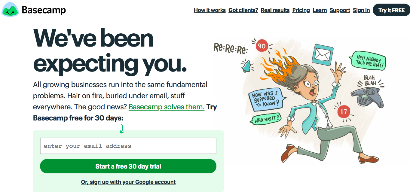
Basecamp uses directional cues regularly on its homepage. (Image credit: Basecamp)
Speak their language
To truly connect with your target audience and influence their online behavior, make sure your website content is written in the language and terminology that they use. Always write website content for humans first, and search engines second.
Make sure you have a specific, defined audience for your website. Don’t try to be all things to all people. And don’t make the common mistake of using internal language or industry jargon on your site. It will frustrate users, and frustration causes friction. Conduct keyword research as necessary to determine what words users are searching to find answers and solutions like yours.
Limit their options
Decision paralysis is a behavioral phenomenon that occurs when a user is overwhelmed with options and therefore unable to act. Don’t let this happen on your website. Make sure the user’s browser is clean and calm. Include no more than one CTA per page, unless you have an extremely long page that appeals to users at multiple stages of the funnel.
Consider two well-known brands and their respective home pages.
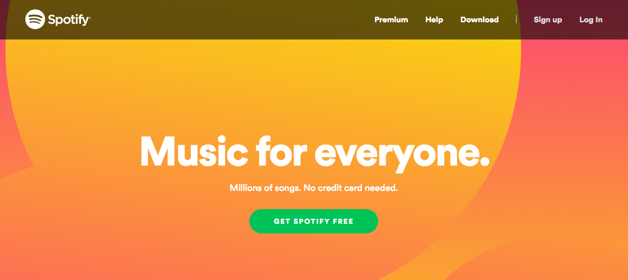 Spotify does a great job of clearly directing website visitors to take a desired action. (Image credit: Spotify)
vs.
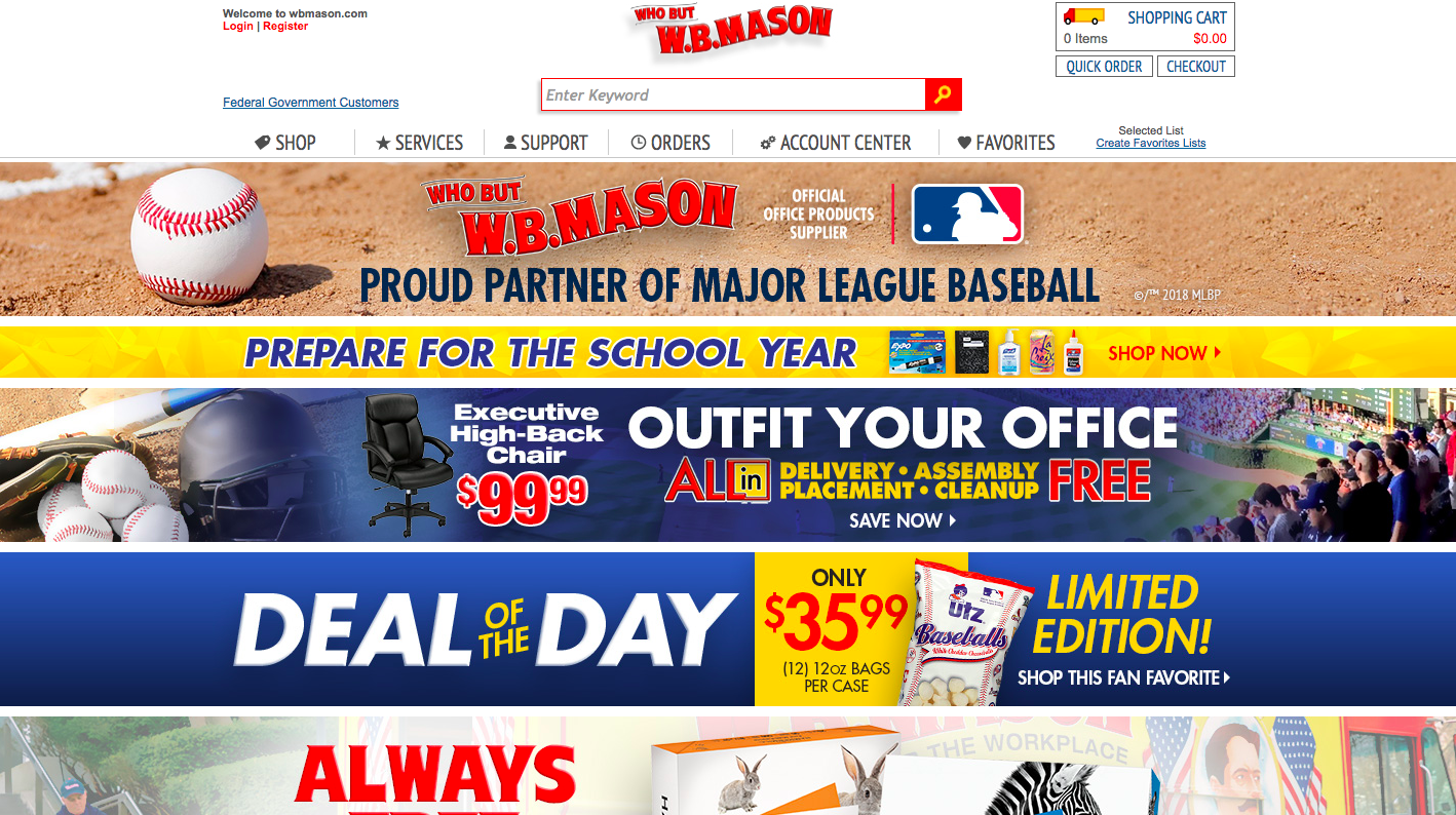
W.B. Mason's home page is overwhelming and includes too many options for a visitor to have a clear user path. (Image credit: W.B. Mason)
See the difference?
The behavior Spotify wants users to take is very obvious, and they make it extremely easy to understand what to do next. Great experience, really easy.
W.B. Mason gives users quite a different feel. The home page is overwhelming and includes too much information, leaving visitors feeling overwhelmed and overloaded.
When determining what behavior to suggest on a page, if you find yourself stuck because you can’t decide between two potential user paths - a free trial and a free demo, for example, there are a couple of options:
- Set up an A/B test to show both versions equally to your audience for a set amount of time to declare a winner.
- Use smart content to show certain content to one set of users and other content to another specifically defined audience. For example, you can show an ebook only to users who have already registered for your upcoming webinar. The result is a more personalized, tailored user experience and higher conversion and engagement rates with your site.
On landing pages, be sure to remove users’ navigation temporarily until they convert on the form. Always keep forms as simple as possible, requiring only as much information as your sales team needs at the corresponding stage of the funnel. For top-of-funnel leads, this usually just means a name and an email address.
Remove friction
Friction means any variable, website quality, or user behavior trend that is slowing down or halting the progression of your company’s sales cycle. You can think of friction as anything that prevents your users from accomplishing the goals you’ve sent out for them.
Friction can come in the form of anything from a difficult-to-use website to the slightest feeling of uncertainty or doubt in your users. Reducing your website’s friction will lead to increased user engagement and greater likelihood that your users will take the action that you want.
Here are some common examples of friction:
- A cluttered menu or interface
- Distracting or arbitrary visuals
- Unnecessary decisions, actions, or thinking required
- Confusing direction
- Functionality that is anything less than intuitive
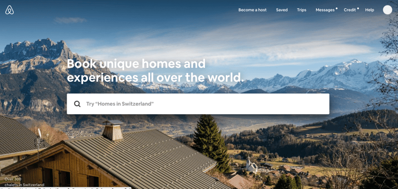
Airbnb does a great job removing friction from its home page. (Image credit: Airbnb)
Organization matters
A clear and user-friendly website navigation is necessary if you want to direct users to explore your site and take desired actions. Organize your website navigation in a way that lets users explore the solutions relevant to them and learn information about your company that will validate their decision.
When laying out the structure of your website, don't try to reinvent the wheel or be overly clever with your naming conventions. Instead, use familiar patterns so that people will recognize how they are supposed to interact with your website. Don’t invest too heavily in trendy designs. Always optimize for user experience, and be sure to rigorously test all elements of your optimized website in different browsers and on different devices.
There is no one right answer when it comes to optimizing your website navigation. Conduct user testing to gain critical insights into how people use your site. Use this data to adjust your website navigation architecture so that it best meets the needs of your users.
Rely on analytics
Any website optimization project should include heavy consultation and reliance on your analytics. The data within your analytics is incredibly valuable when it comes to determining and prioritizing what optimizations will be most impactful.
Be sure to review the following:
- Review top entrances and exit pages
- Review user flows to see where users go
- Use heat mapping to get more insight
Use the insights you gather from your data to inform your strategy and optimize your website for better results over time.
Follow the steps above to start influencing user behavior on your website to produce desired results, like more leads and new customers.
Download Strategy Blueprint: How to Use Marketing Automation as a Sales Tool to discover how to leverage the incredible lead- and revenue-generating power of marketing automation.
Leverage the power of marketing automation to generate leads and revenue.