When it comes to landing pages, conversion is the name of the game.
 Optimizing landing pages for conversion is a great skill that will open up your funnel's floodgates, increasing leads at all stages. No matter what download, opportunity, engagement, webinar, or other asset you're promoting with your landing page, there are several best practices you can follow to skyrocket your conversion rates.
Use these guidelines to build landing pages that convert like crazy and fuel business growth.
Landing Page Conversion Best Practices
1. Include an image.
Including a relevant image on your landing page will increase your conversion rate substantially. Studies show that adding an image to a landing page increases conversion rates considerably. Use good judgement - don't include images that are overwhelming or distracting, and definitely don't include anything that's offensive.
Interestingly, industry research suggests that including an image of a human face works best. The philosophy is that users see themselves in the image, and including an image of a human face is a great way to foster that connection.
2. Nix the nav.
Perhaps the number one rule of landing page conversion rate optimization is to remove your website navigation from your landing page header and footer. You do this in order to limit the user's options so that they are focused on the one action that they should take - convert via your form. This creates an obvious conversion path for your user.
Return the navigation on a confirmation page that renders upon form submission so that users can continue to browse your website post-conversion.
3. Tell visitors what to do.
A landing page is not the right place to be coy about what you want.
If you want your landing page visitors to complete the form, tell them! Use your landing page to quickly get to the point. Don't leave lead conversion up to chance. Explicitly explain to your users exactly what they are expected to do on your landing pages. Use action-oriented language to describe what steps are required and items they'll need to do next. Use directional cues like arrows or contrasting colors to carve out a clear path to action.
4. Finesse the form.
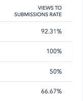 Often, the single most important factor when it comes to landing page conversion rates is the form used on the page. When a client is looking to increase their conversion rate on any landing page, the form is almost always the first place I focus.
The best advice I have is to consider interacting with your landing page through the eyes and mind of your website visitors. Would you want to or be willing to complete a form with 14 different fields, just for a tip sheet? Probably not. Would you be willing to disclose intimate financial details about your company or your direct phone number in exchange for an infographic? Unlikely (even though this information is gold for initiatives like lead scoring and account-based marketing).
You need to align your form with the specific offer you're gating with your landing page. First, identify which stage of the funnel you want to target:
- For top-of-funnel content, like ebooks, free guides, or infographics, request or require up to four fields (typically first name, last name, email address, and company name).
- Middle-of-funnel content, like webinars, case studies, or online assessments, can demand a bit more, such as industry, job title, role, or location. Including no more than 7 fields here is generally best for optimal conversion rates.
- For bottom-of-the-funnel content, like software demos, in-person assessments, or consultations, you can ask for the most information. Fill in details like company website, phone number, address, and more at this stage. However, you should still try to keep your form fields under 10, even for bottom-of-the-funnel offers.
Another effective strategy is to utilize progressive form fields. When a previously converted lead or prospect returns to your website and accesses a form, progressive form fields automatically replace one or more fields to capture new information from your visitor.
5. Harness headlines.
Headlines are a critical part of successful landing pages. Your primary headline (h1) is the first thing that your user will see when they hit your landing page, so it needs to be attention-grabbing and powerful, yet still descriptive. Usually, it is best to clearly describe the offer presented on the landing page, and to speak as directly as possible to the pain point or question that the user is seeking to solve or answer at that moment.
Use secondary headlines (h2, h3, etc.) to call the user's attention to important elements of your landing page. Keep in mind that search engine crawlers give heavier weight to words that are included between any header tags in the html, and while many landing pages are short and succinct, don't underestimate the organic traffic they can drive.
6. Bullet the benefits.
One common theme you'll come across in digital marketing over and over again is that people don't *read* online - they skim. To account for this known digital behavior:
- Construct your landing page in a way that is easy to skim
- Utilize headings and sub-headings
- Make good use of bulleted and/or numbered lists.
Use your bullets to artfully and directly describe what the user will learn or gain in exchange for providing their contact information via your form. Make your offering irresistible, and be sure to write in a language that your target audience uses and understands.
7. Add validation elements.
Your landing page should include at least one element designed to inspire trust in your brand. There are a handful of common categories of validation elements. Use whatever tactic or combination makes the most sense for your audience:
- Client testimonials (written is great, video is even better)
- Awards or other accolades
- Major publications or media outlets where your brand has been showcased
- Logos of blue-chip or well-known customers (be sure you have permission)
- Reviews, ratings, or Net Promoter Score
8. Match the CTA.
More often than not, a visitor arrives at your landing page because they have clicked through from a call-to-action (CTA) of some kind, placed either on your website, blog, social media, or digital ad. The more closely your landing page matches the CTA that drove a user to your page, the higher you can expect your conversion rate to be.
Use similar or identical phrasing, and be sure to align the imagery you use on both assets. If you're unsure how this might impact results, try A/B testing a new CTA for each landing page first.
9. Personalize your pages.
One clever way to improve your landing page conversion rates is to personalize the information and experience for your visitors. How, you ask? Use dynamic content that populates automatically based on what is known about the user. This can be accomplished by setting up a series of rules on the backend of your page.
Here are some examples of how to use personalized content effectively on your landing pages:
- Automatically populate the user's company name if it is known
- Show a specific image based on the visitor's industry
- Include a slight variant of your headline to those who belong to an organization of a certain size
- Include a "welcome back" message for return visitors
- Use seasonal or event related messaging
- Adjust the UX of the page if the user comes in through a mobile device
- Elevate social sharing buttons if the user comes in through social media
You can even go as far as to show and hide entire sections on a page. For example, you could include a testimonial for anyone that came from outside of the your website. It is easy to get carried away, ask yourself if specific dynamic content is going to drive more conversions.
10. Test everything.
The most effective landing pages don't become that way by accident. Rather, they are improved continuously over time through the effective use of A/B testing.
There are so many variables you can A/B test on a landing page to improve your conversion rates: headlines, images, copy, forms, length, colors, etc.
When setting up an A/B test, keep the following best practices in mind:
- Establish a hypothesis first.
- Allow a statistically significant sample size to accrue (usually at least 800-1,000 unique visitors and sometimes more if you want to segment by conversion behavior by audience)
- Test only one variable at a time.
- Keep a detailed record of your A/B tests and results so that you can apply your learnings to future pages.
Tools to Help You Create Awesome Landing Pages
Lucky for you, there are many, many tools out there designed to help marketers create amazing landing pages that convert like crazy. Here is a quick list of some of my favorites:
- Google Optimize - free A/B testing software that requires no coding knowledge and can be installed via Google Tag Manager
- Lucky Orange - dynamic heat mapping and visitor recording tool
- HubSpot - all-in-one digital growth platform with awesome landing pages tool and built-in A/B testing
- Unbounce - landing page optimization platform, particularly for paid ads
Want to know more about generating awesome lead generation results from your website? Optimize your website starting with a free website audit. Click below to schedule your free website audit now.


